In Indonesia, digital payments via QR (GoPay) were offered to our merchants as part of an app called GoBiz. This is a tool used by merchants who are listed as online food delivery businesses on GoFood.
GoFood is like Grab food or Uber Eats or Zomato.
When the decision to approach a standalone GoPay merchant app was conceived, this new app for small businesses needed an efficient onboarding flow.
The process to onboard small businesses to our payments ecosystem had several issues:
The acquisition rates were frustratingly low. As our digital payments technology business expanded at GoTo Financial (part of the Gojek TokoPedia group in Indonesia), it became crucial to simplify the merchant onboarding process to reduce friction and ensure the platform supported growth.
Our users were small and medium sized business owners in Indonesia. They needed a bespoke approach to onboarding tailored to them.
Find specific areas needing improvement. Be it UX, tech, service or business strategy related.
Approach to test a streamlined onboarding, without a fully launched launched app
Jump across the vast expanse of this case study:

Taking Stock of the Funnel Data
We had a rudimetary funnel at the start. We had only a few data points that indicated the main problem areas. The only basic funnel data we had came from when the QR payment service was only available via the Gobiz app, which is mainly used by restaurants, similar to Zomato, uber eats etc. It showed how poorly our service for getting payment QR codes performed.

Theme Emergence
From the data we could clearly see that the drop-offs severity was closely related to some universal themes:

However we also hypothesized additional themes may have a role to play; as suggested by older research, but we had to ensure efforts in these areas were justified by more recent findings. These themes are:

Competitor Study of Onboarding Flows
We studied the competition, in two parts. First we looked at the experience being offered. And later we also performed competitor time trials to gauge SLAs, after our first iteration was implemented as a pilot.

Learnings

TIME
Dana is the most popular and currently fastest at delivering a QRIS.
TIME
We were the slowest, but most compliant with regulation and compliance.

EFFORT
OCR was present in one competitor, and KYC appears to be skipped or approached in parallel

COMS
Except for Grab, the UX writing on the competitor apps was largely very Jargon heavy.

COST
Some competitors are offering 0% MDR (Commission)
Diary of a Sales Person
For us to quickly gather more qualitative feedback, we reached out to our merchant sales team. These field agents were sometimes onboarding merchants too, so they would experience the reasons why some merchants are unable to self-onboard. We agreed to arrange for the sales people to keep a log of merchant sentiments as they onboarded, and list their experiences for one week (Diary Study). They shared the following:
TIME
They were acquired by our competitor while they were waiting for our KYC to complete.
TIME
Merchants would get tired of waiting to hear back, so they simply would not log in again even if their KYC was approved.
EFFORT
We asked for several things which required a long sitting to complete, and they were quite busy.
EFFORT
Manually entering details for IDs causes errors, needing support team to assist in making corrections.
COMS
Merchants don't understand why some info like outlet address is needed for enabling digital payments.
COMS
Merchants are not prepared with the documents or information they need.
COMS
Complicated status reporting system which confused merchants. They needed their tech savvy members of the team or family to help out.
COMS
38% percent of rejected merchants raised support tickets regarding rejections because they don't know why they got rejected.
COMS
Merchants actually expected to receive their QR in the mail. They thought that was the reason we needed an address.
COST
Merchants don't have enough clarity on fees and needed someone to explain it to them. If a sales person was there to explain then merchants were equiped to decide.
Mapping the current state
A current state journey helped us map the findings to pinpoint which steps to eliminate or improve. There were issues in the application’s flows and our operating procedures. Pictured below are those related to the UI.


LOG-IN/SIGN-UP
Too many choices, and instructions were not providing an easy low barrier entry.
EFFORT
The older designs did not showcase the service or the benefits to the users.
COMS
Confusing for people who do not finish submitting in one sitting. If they stop halfway, then they need to click on log-in since this screen prioritizes sign-up, it could confuse some users.
COMS

VALUE PROPOSITION
The value proposition was positioned after the user created an account. In self-serve best practices the user needs to be convinced first.
COMS
These benefits were based on past research. Since we were now targeting a different merchant segment (SME, Retail) it was not relevant anymore.
COMS
The commission was shown in order to be transparent, but our competitors offered 0% MDR.
COST

POSTAL CODE
Previously this was needed for food merchants who were delivering food. Now we were not limited to food merchants.
COMS
The more modern way to do this is to provide a location picker, which has become more ubiquitous. However Most people did not know their postal code. Especially for their business address.
EFFORT

INSTRUCTIONS
Generally this page helped merchants prepare. BUT it was demanding difficult to consume and thus easily ignored.
EFFORT
Most merchants needed to look for their information or documents. They didn’t have it on hand.
EFFORT

ID DETAIL FORM
Apart from being enormously long, the user had to do complicated photos of their ID and Selfies with IDs, all without getting too much real time feedback and inside a webview UI. The KYC team had to check these manually and provide feedback to the merchant.
EFFORT
There was no OCR happening on the uploaded photos, everything had to be typed manually.
EFFORT
From a compliance perspective we were doing as prescribed but there was a need for modernization to reduce the manual effort.

BANK INFO FORM
Bank info was needed if the merchant earns money and needs to have it disbursed. Merchants were doing neither of these things immediately. So it held down our onboarding.
TIME
The validation failures on this step would hold up the entire submission.
EFFORT

BUSINESS DETAIL
The business categories were being pulled directly from the PTEN (Issuing authority) list. This was huge. And it led to a lot of cognitive overload to match businesses to the category easily.
EFFORT
Business naming was not simple, we required businesses to indicate their area. Again this was something we inherited from the food delivery onboarding.
EFFORT
If the address from different from the ID, and it almost always was, then on top of lat/long the merchant would have to also manually enter their address.
EFFORT
Pilot for Future State Design
And combining all these initial learnings, we came up with a possible hypothesis for a future state in roughly 2 weeks. This skeleton would allow us to test, in a controlled environment, whether the updates could solve our initial problems or not. Service related issues could also be tested with a limited release.


VALUE PROP PAGE
Lead onboarding with value propositions.
COMS
Providing a low barrier entry to enter the app.
EFFORT
EXPECTATION SETTING
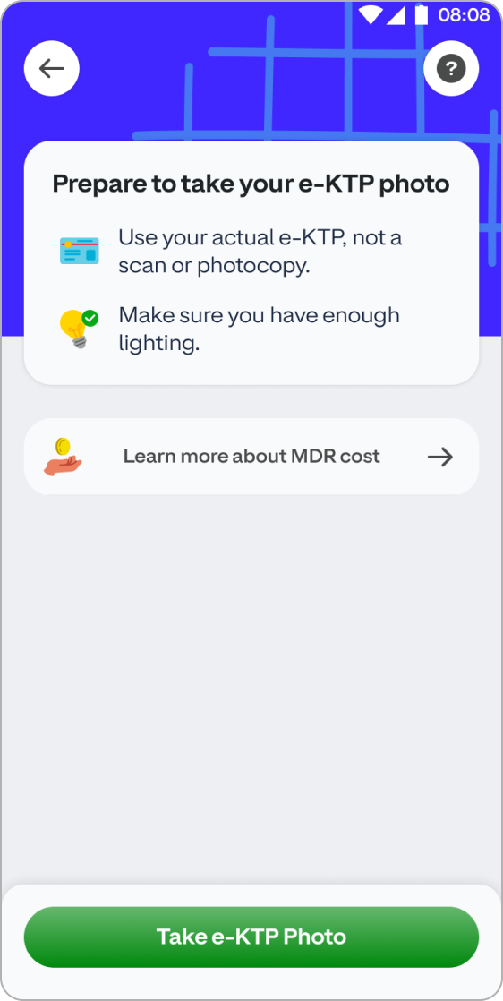
Provide a simpler prep guide so merchants have their ID document and are ready to proceed.
EFFORT
Give merchants an opportunity to learn about MDR.
COMS

AUTO-SCAN DOCUMENT
Instead of typing, our new flow proposes an OCR-first Approach. To help merchants reliably and quickly submit their IDs.
EFFORT
Ensure merchants are directed and provided appropriate realtime feedback during photo capture.
COMS

business information
Capture business information with simplified controls providing an address with a location picker, and progressively capture typed address if the area is not available via cartography APIs.
EFFORT
Clarify optional fields very clearly.
COMS

ONBOARDING PROGRESS
Apart from being enormously long, the user had to do complicated photos of their ID and Selfies with IDs, all without getting too much real time feedback and inside a webview UI. The KYC team had to check these manually and provide feedback to the merchant.
COMS
EFFORT
Progressively disclose other steps to fully onboard merchants.
COMS
Seeking answers to our knowledge gaps
At this point we were approximately 3 months away from the public launch of the app. To summarise the progress until this point; we had some answers to one of our initial questions, however we needed more research to address why merchants were not using their newly acquired QR codes and why some merchants were “failing” simpler tasks during the flow. Our current material had the following issues also:

Once marketing for the our new app would begin, a flawed funnel would cost us leads. However in the long term, the service value and its visibility and reliability were important areas to build confidence. Here were some grounding questions:
In the first quarter of 2024 we were wrapping up foundational research on how our small and medium business owners operate their business. As those efforts came to a close we understood which parts of their business decision making was driven by the customer, and how their ecosystem of suppliers influenced other aspects. Thus our personas and who we were designing for was largely clear.

This allowed me to lead the execution of a more focused plan where we discovered the motivations and behaviour through several qualitative insights.
TIME
Being able to close transactions quickly, is much more efficient and time friendly if there is a long queue during rush hour.
EFFORT
Merchants don't need to make arrangement for cash or change, this sames them a lot of effort and pains of cash handling.
EFFORT
Digital money helps eliminate too many visits to the deposit machine, which are not always accessible by all merchants.
COMS
When customers request the business to go digital, its usually the main motivator for adopting QR payments.
COST
Some businesses that only accept digital money say they don't have to train staff to handle money or do old-school recap/recon involving cash.
EFFORT
Not being able to use money ASAP i.e settlements schedule is not helpful or flexible. OR if the bank is digital and there are no ATMs
EFFORT
Small or micro businesses find it difficult to do accounting especially when commissions are charged per transaction.
EFFORT
Operating in an “offline” area automatically dissuades them.
EFFORT
Not all business owners had the newer ID format called e-KTP, as a result they were not able to pass KYC, as it is a requirement to publish a payment QR to a business.
COMS
Hearing Stories about fraud from other owners deters them from going digital.
COMS
Merchants may not have a business name yet. Our onboarding copy implies an established business.
COST
Some businesses that only accept digital money say they don't have to train staff to handle money or do old-school recap/recon involving cash.
These insights allowed our business to calibrate the strategy surrounding our service. Below are a few of the initiatives.

Finally this led us back to the UI where our team could iterate based on more current research, and the direct qualitative and quantitative feedback.
After analysing the pilot design’s performance and the feedback from our pilot phase users, we identified issues with the pre-launch experience. We decided to address these with more iterations aimed at addressing the qualitative nuances.


Simplyfying authentication
Merchants often paused onboarding due to missing documents, and the first iteration de-prioritised log-in.
During the pilot phase, we decided to test how merging log-in and sign-up would perform.
This led us to build the automatic funnelling system needed to remove the decision point for users, ultimately reduce drops.
TIME


Comission Free QR
Based on additional research, Merchants expected a free QR payment service, and hence would be more willing to onboard. As we learned from competitor studies, it was already precedented in the market.
Thus business and monetization strategies adjusted our approach and adjusted based on business size.
COMS


Ordering Printed QR
The pilot Merchants expected a way to receive a printed QR from us, and preferred the printed QR too.
This led us to reconsider the scope of our service and make it operationally possible for them to order printed QRs and acrylic stands.
COMS
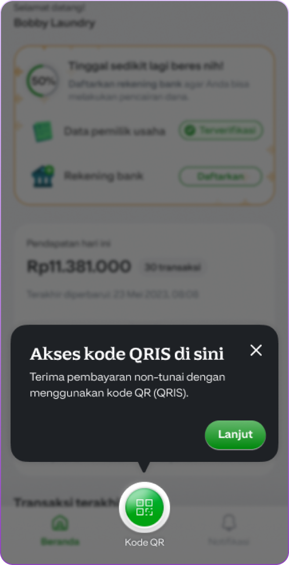

QR-CODE hANDLING
When a QR was ready to share with the merchant, initially we simple enabled navigation and accompanied it with a coach mark.
However merchants did not notice it, nor were the various actions related to the QR accessible.
Hence we transitioned to something that was a more prominent announcement.
COMS
Once we wrapped up the tweaks for the launch version, it went live two weeks before the big announcement. This gave us a chance to squash a bunch of bugs and fix performance issues. Sure, it also highlighted more areas to check out, but the latest version for onboarding our merchants was solid enough to ship.


In addition to the performance we also noted a jump in conversion. The ratio of merchants getting activated definately increased, but so did the number of new merchants transacting. Moreover the following correlations were also observed.

Earlier, I pointed out that our telemetry was lacking in showing the health of UX. Therefore, when we revisited several areas, we added UX metrics to our documentation and teamed up with data and engineering to implement listeners. This gives us a much clearer picture of what our merchants are doing on each step.

All of the efforts from the above, bore fruit and significantly increased the, speed, performance and reliability of the merchant onboarding process.
Which provided the business a reliable funnel to convert leads. Thus it then became an exemplar platform that other merchant facing apps in the GoTo ecosystem would adopt to speed up their merchant acquisition funnel and onboarding quality. A summary:


